






Public data lets us see patterns within municipal boundaries
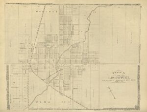
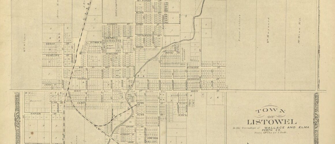
Town map of Listowel from the 1879 Historical Atlas of Perth County, as seen in the digitized collection of the Stratford-Perth Archives. Image Courtesy of the Stratford-Perth Archives.
This is a post by Robert Stanton, a Community Research Fellow with the Social Research and Planning Council (SRPC). This post is part of Painting by Numbers: Using Data to Explain Ourselves, an ongoing series by Robert about the various ways data can illuminate local issues.
So far in this series, we have sought to understand our region better by examining aspects of life – pertaining to population, age, diversity, and income – all at the subdivision level (i.e. the level of single-tier/lower-tier municipalities). We have seen how our region is not a book to be judged by its cover. Within both Huron and Perth counties, fortunes and circumstances can vary markedly. Across our region, subsets of our population can face challenges not immediately evident from a regional or even county perspective.
Much the same can be said of the population within each individual subdivision. Issues can be local to, or concentrated around, specific neighbourhoods – sometimes sharply so, as we shall see.
To help shed light on a subdivision’s internal variation, the census offers one more level of granularity. Data may be obtained by Dissemination Area (“DA”), a neighbourhood within a subdivision and the smallest geographical area for which all census data is reported.
A DA typically has a population of 400 to 700 people. Boundaries are, where possible, aligned with existing municipal boundaries or physical features like roads or rivers. Lacking any other means of identification, DAs are assigned numbers rather than names. Thankfully, a map of each DA is available from Statistics Canada.
Analyzing data at the DA level does come with some additional challenges. Working at such a detailed level means that the data files can be very large. The DA-level file for Ontario, within the 2021 census, contains 55 million records. Once navigated and analyzed, however, DA-level data can provide useful information that is not otherwise visible.
Given where we ended last time, with an examination of poverty and income inequality, the Huron County subdivision of Ashfield-Colborne-Wawanosh (“ACW”), is perhaps a good place to start this time. ACW was seen to have higher concentrations of both high-income and low-income households, ultimately leading it to be the most unequal subdivision in Huron-Perth. Taken as a whole, ACW’s numbers are of concern, making it a strong candidate for more detailed study.
The layout of ACW is as shown in the map below. To the north and east are County Roads 86 and 22, respectively; to the south is the Maitland River and the town of Goderich; and to the west is the shoreline of Lake Huron. There are 11 DAs as set out on the map.
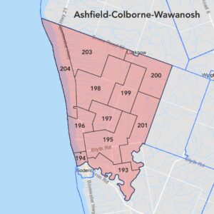
Figure 1. Dissemination Areas in ACW.
Looking at median household income, the picture is as shown below. The highest incomes are to be found close to the river to the south and along the lake to the west, except for in two lakefront DAs just north of Goderich. More centrally, incomes are lower, and they are sharply so in the northeast corner, further from the water.
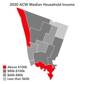
Figure 2. 2020 ACW Median Household Income.
Of course, this begs the question, what is different about the waterfront areas just north of Goderich? Why are incomes not consistently high along the entire shoreline? The next map helps to answer this. Those lower-income waterfront areas in question have populations with a median age above 60, and the number of retired seniors surely has a bearing on the median income in each of those locations.
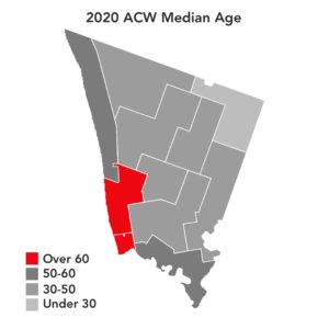
Figure 3. 2020 ACW Median Age.
The median age of 50+ in all of those southwest DAs strongly contrasts with the other end of ACW, where the median age is under 30. Once more, the northeast and southwest are diametrically opposed. Even within a small population (ACW is home to less than 6,000 people), there can be – and in this case are – significant variations between neighbourhoods in factors affecting social need.
This is further confirmed by taking a closer look at low incomes. One of the identifiers of low income used by Statistics Canada is the Low Income Cut-Off (“LICO”) measure. In broad terms, the measure identifies those households likely to spend a disproportionately high share of their income on necessities like food, shelter, and clothing.
The map below shows the percentage of households in low income by this measure, using after-tax incomes, across ACW. Among the striking features of this map are the concentration of low-income households in the northeast, and the degree of separation between the results. The entire southwest of ACW shows less than 3% of households in low income, while the northeast is above 14%.
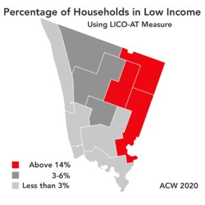
Figure 4. Percentage of Households in Low Income Across ACW, 2020.
For those wondering what might be driving the distinctive findings in the northeast of this subdivision, we shall be returning to this question later in this series.
Collectively, these findings help to show how dissemination area data can provide important insights that can (a) help to explain anomalies in the analysis of subdivisions, and (b) expose important variations in the data, which would otherwise be hidden by the use of an average result for a subdivision as a whole.
Just as income inequality invites examination of ACW, so population growth invites similar scrutiny of another Huron-Perth subdivision: North Perth. Between 2016 and 2021, over 35% of all growth in the Huron-Perth region was in this subdivision.
The map below shows how North Perth is situated, with the community of Listowel at its centre. North Perth comprises a set of rural DAs that among themselves vary considerably in size due to variations in their population density, plus a cluster of relatively tiny areas within Listowel itself.
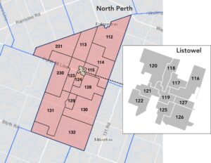
Figure 5. Dissemination Areas in North Perth and Listowel.
As a whole – again between 2016 and 2021 – North Perth had a population growth rate of over 18%. That is more than twice that of any other subdivision and over three times the provincial average. Outstanding though that is, however, it is not even close to the rate experienced within certain parts of the subdivision. The map and the accompanying charts below show what happened in more detail.
In a small DA just to the south of Listowel, DA 124, population growth topped an incredible 80%. Another in the northwest of Listowel was above 44%, and a pair of DAs in the southeast of town saw growth of 27% between them. Just as extraordinary, these four DAs accounted for 79% of North Perth’s entire growth. The driver of North Perth’s exceptional growth rate was a set of just four very small, but highly dynamic DAs.
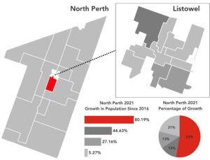
Figure 6. Rates of Population Growth Across North Perth, 2016-2021.
With the patterns of growth now more accurately described, the obvious next question is, who are all these people? The chart below helps to answer at least part of this question.
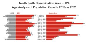
Figure 7. Age Analysis of Population Growth in DA 124, 2016-2021.
The chart on the left compares, back-to-back, the age distribution of the DA 124 population in 2016 and 2021. The number at the end of each bar represents the number of people in that age group. The chart on the right shows just the growth between those two dates, also in terms of the number of people in each age group.
As we can see, within this DA the 2016 population had a notably even generational cross-section, and while the growth does have some peaks and troughs, each generation has continued to be well represented, with noticeable inflows of seniors, working-age adults, and young children. Clearly this is an area that has somehow managed to maintain a generationally diverse community, and to avoid falling into the more siloed patterns quite often seen elsewhere. For other communities seeking to move towards something similar, it could be well worth looking to this area for clues on how to encourage such development.
Arguably, foremost among those clues is the increased availability of somewhere to live. In a DA of approximately 1,000 dwellings in 2021, an impressive 460 of them were no more than five years old.
Coming up on Painting by Numbers: how concentrations in data can reveal additional insights.
United Insights: A Research Blog by SRPC
Subscribe to get United Insights in your inbox.
Got research-loving friends? Send them this post!
Did your research-loving friend send you this? Subscribe