The highs and the lows, and what inequality looks like locally
Vintage postcard showing Benmiller, a community in Ashfield-Colborne-Wawanosh, from the archival collection of the Huron County Museum.
This is a post by Robert Stanton, a Community Research Fellow with the Social Research and Planning Council (SRPC). This post is part of Painting by Numbers: Using Data to Explain Ourselves, an ongoing series by Robert about the various ways data can illuminate local issues.
So far in this series, we have considered various aspects of who and where we are. We shall begin this part by considering household income. For the purpose of examining housing affordability – which we shall be doing later in this series, household income will be a key metric.
The census collects household income data and presents it as a series of specific income ranges along with how many households sit within each range. By calculating the percentage of households beneath the breakpoints between those ranges, we can produce a data-driven estimate of the household income distribution across Huron-Perth.
For example, we can see that approximately 60% of households have incomes at or below $100,000 and 40% have incomes above, meaning that an income of $100,000 sits just above the 60th percentile of the distribution.
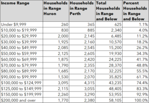
Figure 1. Household Incomes in Huron and Perth Counties
If we arranged the incomes of every household, from the lowest on the left to the highest on the right, the result would look something like this distribution curve shown below.
In keeping with many distributions, there are more households towards the middle and fewer at the extremities, which is what gives the curve its distinctive inverted “S” shape – steeper at the ends, flatter in the middle.
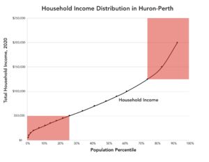
Figure 2. Household Income Distribution in Huron-Perth
In the course of working with the household income data, the opportunity was taken to look more closely at these extreme regions. Specifically, households with incomes above $125,000 or below $50,000 were selected, as these equated to approximately the top and bottom quartiles (25%) of all households.
Beginning with the high incomes, the red columns in the chart below show the number of high-income households in each subdivision, while the black line shows the percentage of local households in the high-income category.
While Stratford may have the most high-income households, that is because of its population size. When you adjust for that by looking at the proportion of households with high incomes, Stratford is below average.
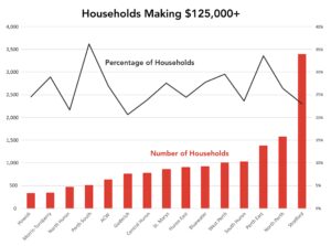
Figure 3. Households Making $125,000+, 2020
In Perth South, meanwhile, high-income households make up over 35% of the total, with Perth East not far behind.
As we have seen before in this series, Huron-Perth can be a region of contrasts. As we have also seen before, the data can be better at identifying significant questions than providing the answers. We can see marked differences, but not necessarily the factors driving them. The purpose of the analysis is sometimes just to alert us to the symptoms, rather than provide a diagnosis.
Turning to low-income households, the picture is, as one might expect, very different. This time Stratford, with a high proportion of a large population, tops the list by a long way, with over 4,000 households in this category. North Perth, the next highest, has less than 1,500.
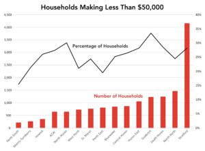
Figure 4. Households Making Less Than $50,000, 2020
As we saw with high incomes, the divide is not simply urban versus rural. That is a general trend, but the presence of anomalies suggests some nuance to the story as a whole. Goderich has the highest proportion of low-income households, with over 30%, but North Huron is not that far behind without the same degree of urban concentration.
So far, we have used the terms “high-income” and “low-income” simply to refer to the top and bottom quartiles of Huron-Perth’s households. In Canada, however, there are more formal definitions of low income that are commonly used, and which are captured by the census.
The Low Income Measure (or LIM, or sometimes LIM-AT to denote “after tax”) is a relative measure, based on median household income. A household earning less than 50% of the median is considered low income. This is a measure recognized in Canada and internationally.
The Low Income Cut-Off (or LICO, or sometimes LICO-AT to denote “after tax”) is an absolute measure geared to the cost of living. Low income is determined by the proportion of income spent on necessities like food, shelter, and clothing. LICO is used within Canada specifically.
The chart below shows the prevalence of low-income households in Huron-Perth and defined by these measures. To provide some context, the results for Ontario and Canada have been included for comparison.
The columns denote the LIM result, while the black line shows the LICO score.
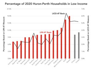
Figure 5. Percentage of 2020 Huron-Perth Households in Low Income
Ashfield-Colborne-Wawanosh (ACW) significantly exceeds national and provincial levels by both measures, and Howick’s LIM score also looks to be very high in a national or provincial context.
While the LIM and LICO measures of low income continue to be used widely in Canada, the official poverty line is set by a third calculation: the Market Basket Measure (“MBM”). First defined in 2000 and set as the official poverty line in 2019, the MBM defines poverty based on the cost of a specific basket of goods and services that a family needs to achieve a modest, basic standard of living.
By the MBM measure, the number of people living in poverty in Huron Perth in 2020 – in absolute numbers and as a percentage of the population – was as shown in the following chart.
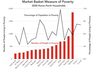
Figure 6. Market Basket Measure of Poverty by Municipality, 2020
For comparison, the poverty rates (population percentages) of Ontario and Canada have been included.
While the use of three different measures can be confusing, the results of the LICO and MBM calculations are reasonably consistent, particularly in relation to the locations most affected by poverty and low income as a percentage of their populations.
Another commonly used indicator of socio-economic stress is income inequality. Again, this is captured by the census, and again, two measures are recorded: the Gini coefficient and the P90/P10 ratio. The Gini coefficient evaluates the entire distribution of income, ranging from zero (perfect equality) to one (perfect inequality). The P90/P10 ratio compares the 90th and 10th income percentiles, dividing income at the 90th percentile by income at the 10th percentile — in other words, it shows how much richer the highest-earning households are than the lowest-earning households (2x richer, 4x richer, etc).
In the chart below, the columns show the Gini coefficients, while the black line shows the P90/P10 ratios.
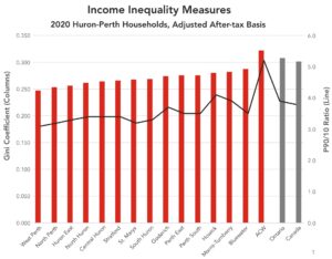
Figure 7. Income Inequality Measures by Municipality, 2020
Not surprisingly, given its low-income ratings, ACW scores highly on both income inequality counts, though the Gini coefficients of all subdivisions are broadly comparable to those of Ontario and Canada as a whole.
To help explain what it means to have a better or worse Gini coefficient, the chart below compares the income distributions of West Perth and ACW, the most and least equal subdivisions respectively in Huron-Perth.
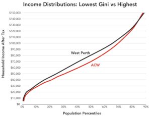
Figure 8. Income Distributions: Lowest Gini vs Highest
For most of the distribution, ACW shows a pronounced lag in incomes that is greatest in the mid-range. Taking $40,000 as an example of a lower income, the chart shows how ACW has more of its population of households at or below this figure (i.e., on or to the left of the curve) – about 20% for ACW compared to about 15% for West Perth. In the middle of the curve, the gap is greatest: close to 60% of West Perth households have an income of at least $70,000, whereas only 50% of ACW households have an income at or above that figure. Then the gap closes again as incomes increase, if we take $110,000 as an example, where ACW has 25% of households making more than this compared to just under 30% for West Perth.
The inequality is most dramatically revealed by the very highest range of the distribution, where ACW’s line crosses West Perth’s. Unlike at most income levels, there are actually more households in ACW making over $150,000.
On a national or international scale, Gini values can help to identify reduced social mobility, a negative effect on economic growth, or a higher risk of social tension. More locally, as we see them here, they can be very helpful in highlighting economic vulnerability and/or a potential need for social support.
As this series moves on to look at income in relation to housing affordability, we shall see that much is often made of the median level of household income. As we have seen here, however, there is much to be studied and understood when it comes to levels of income across Huron and Perth counties, how they may differ within our region, and what this may mean for those who live here.
Coming up on Painting by Numbers: employment, individual incomes, and how granular census data helps us zoom in on Huron-Perth communities.
United Insights: A Research Blog by SRPC
Subscribe to get United Insights in your inbox.
Got research-loving friends? Send them this post!
Did your research-loving friend send you this? Subscribe